I rose this morning and to my utmost horrific surprise witnessed the deletion of my very last post (of 2nd March, 2009) from the blogger. I have no idea at all how it happened. But thankfully I always keep a back up of all my posts and through them I am able to restore any post if need be. The post when got deleted was also having few very interesting comments. It's appropriate to add them to the post.
As I had imagined, with a little practice and experience, now I am able to achieve a speed where one page is not taking more than 2-3 hours to color. That too when minute details are also taken care of. Now my next target is to minimize the time further to something one and half hour per page without compromising with the quality.

Couldn't resist myself from some experimentation, purely for fun. So, in one panel I have used a real life picture as the background. The pic was taken by my daughter a few days ago on a colorful spring evening from the terrace of the home.
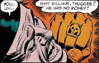
Friends, I am feeling very happy in presenting next ten pages (page 11 to 20) of the current strip, Phantom #S136 "The return of the Thuggees". Hope everyone like them. Your feedback will help me improve the quality. Specially, if you can point out any short-comings in the work. So, I am looking for it.
Phantom #S136 "The Return of the Thuggees"
The link for page numbers 1-10:
http://www.mediafire.com/?rnnyz0dnm2j
Download complete strip here: http://thephantomhead.blogspot.com/2009/12/completed-phantom-sunday-strip-136-full.html
----------
Meanwhile I was taking a deeper look at some of the phantom books from different publishers from the perspective of coloring. While most of the coloring work is just OK, some of the publications appear better than the others.
Harvey hits 1958 | 1. Harvey Hits: A very old series. They published original Falk stories with Wilson McCoy artwork. It seems that coloring plainly without much experimentation was the established rule in those early days. So we see a minimal use of colors. The entire page is filled using only 4-5 colors but the selection of colors is soft and easy on eyes. |
| 2. Gold Key/ King/ Charlton Series: Most of the work was from Bill Lignante, another of phantom artist which is often not considered among the more popular people, but who produced some very good drawings. Unfortunately, the coloring of these series was sub-standard and that also caused the artwork to appear ordinary. Take a look. |
Gold-Key 1963 | King 1966 | Charlton 1974 |
| 3. Indrajal comics: During my childhood, I always found the colorful presentation of indrajal stories very exciting. But looking at them now in light of others work, it seems indrajal was highly inspired by the order of those olden times, i.e., coloring with minimum of effort, choosing only a handful of vibrant colors. Surprisingly they continued in the same style for their entire publication life. Minor mistakes were routinely overlooked. |
| A very early indrajal. Only 5-6 colors are being used here though the colors are soft. Look the color of the horse in the last panel. Too much of liberty the coloring artist takes sometime. | #007 Man Eating Plant (1964) |
#134 The Crime School (1971) | Now one from early seventies. More dark colors were in use as can be observed here. Though there was opportunity to show some fine coloring, but indrajal contended themselves with only the basics. |
| Late seventies show some kind of improvement. Light colors are used nicely. Good reflection effect has been created using white. | #275 The Masked Assasin (1977) |
#394 The Call of the Jungle (1982) | And they are at it again. Too dark coloring with amateurish touch in leaves. Blue and orange/red is used only to make the page more vibrant but depth is missing generally. This is early eighties work. |
| And finally one from late eighties. Still we see the same pattern while printing technology was improved considerably worldwide. | #V25N08 The Masked Avenger (1988) |
| Financial constraints might be the reason behind indrajal's simple coloring. They were selling their product at quite low rates and this can be easily imagined that putting more money for improving coloring quality might have been difficult for them. |
| 4. Newspaper Strips: Those were good indeed as can be seen here in the samples. Some of these are from illustrated weekly (an indian publication) and others from foreign newspapers. I like them over most comic books. |
| |
| |
| |
* Illustrated Weelky scans taken from CWs post. Thanks are due to him.
Will continue the topic in the next post - Next time, some very good and some very bad coloring work examples from other publications.
-----
The following comments were there on the post when it got deleted:
1. Rakesh: PAR EXCELLENCE ---- NO OTHER WORD TO DESCRIBE IT.
MY BEST WISHES
RAKESH
2. JP: Very interesting read! I was a huge fan of comic strips in Illustrated weekly of India. Keep up the good work.
3. The Phantom Head: @Rakesh: Thanks and welcome. I'll try to speed up so that whole strip can be completed in quick time. But it is a mammoth 65 page story. Your support through feedback is much appreciated. @JP: Thanks. Illustrated Weekly of India was one of those rare publications which carried full colored versions of phantom strips. They were very good indeed. The larger than life phantom picture against the backdrop of jungle in the title panel was very exciting. I just loved it. Thanks for your visit and comment.
4. Comic World: Again nice performance TPH.Illustrated weekly was the 1st magazine in which Phantom strip did appeared in India,its coloring was very good and the glossy page of IW gave it a much better appearance,though later on IW shifted on publishing strips in B/W but still they remained quite better in terms of page and printing technology.
5. The Phantom Head: @CW: Thanks and welcome. Excellent info. I didn't know that they also published in b/w. You are having a good collection of IWs. Do they have any complete strip? In case you have it why not post it? It would be an exceptionally good post and unique also. Even if some pages are missing, you can replace them with b/w strip or ijc version. consider it a request.
6. Ciro: Interesting article! interesting experiment!
i hope you continue on this way!!
Ciro
7. The Phantom Head: @Ciro: Welcome Ciro. I am very happy that you liked the coloring. I'll continue and possibly with increased speed.
-----


